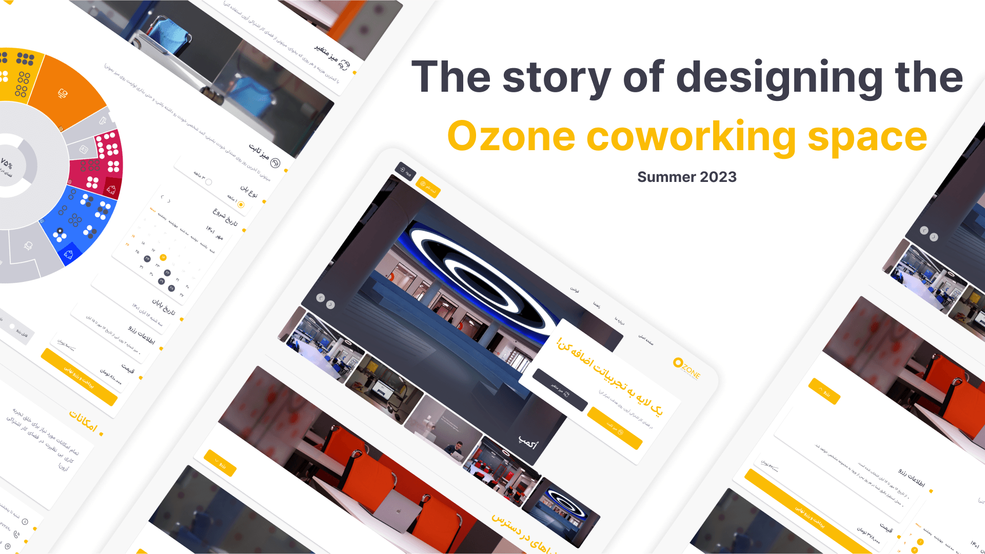
The story of designing the “Ozone” coworking space website
I was thrilled to be assigned to design the Ozone coworking space website in the early summer of 2023. It was my first project with the team, and I was determined to do a good job.
But first, what’s Ozone? Where is it? And what’s it all about?
Ozone, a coworking space, was opened in August 2019 by Dr. Tehranchi and Dr. Mousikhan. However, the opening was delayed due to the COVID-19 pandemic. (COVID-19 was actually a good thing for me.)
Ozone is a modern and safe space for anyone who needs a friendly and productive work environment.
Ozone’s goal is to create a new approach to work and collaboration.
Ozone is located in the Syntech Technology and Innovation Center building, next to Azad University of Barajin, Qazvin. This makes it accessible to everyone, including individuals, students, teams, and startups.
Ocamp | A space for events
. . . . .
Let’s get back to the main story:
The product owner came to me and gave me a brief overview of the project. The goal was to create a website that made it easy for people to book a table at a co-working space.
This was a great opportunity, but there was one problem: we didn’t have much time to finish the project.
So I started researching co-working spaces. I wanted to understand what they were and who our competitors were.
I found that there were a lot of websites about co-working spaces. Most of our competitors were based in Tehran, but there was one other co-working space in Qazvin.
I didn’t want to limit our competition to just Qazvin, so I decided to research all of our competitors. I wanted to make sure that our website was the best, not just in Qazvin, but in the whole country.
A review roundup of competitor websites
I reviewed almost all websites of co-working spaces and realized that you have to visit in person to book a Desk. But this was not what we wanted; we wanted to give people the ability to book their desired table without the need to visit in person, pay the fee, and benefit from all the facilities of the space on the desired day. This was really a winning card for us.
In the meeting, it was mentioned that there is a map, a map that shows the location and Desk of the space.
Well, I searched more and looked for similar examples on foreign websites; until I reached the WeWork website. On this website, there is a small map for the private office section to show you the location of the office you choose, and you must download that map.
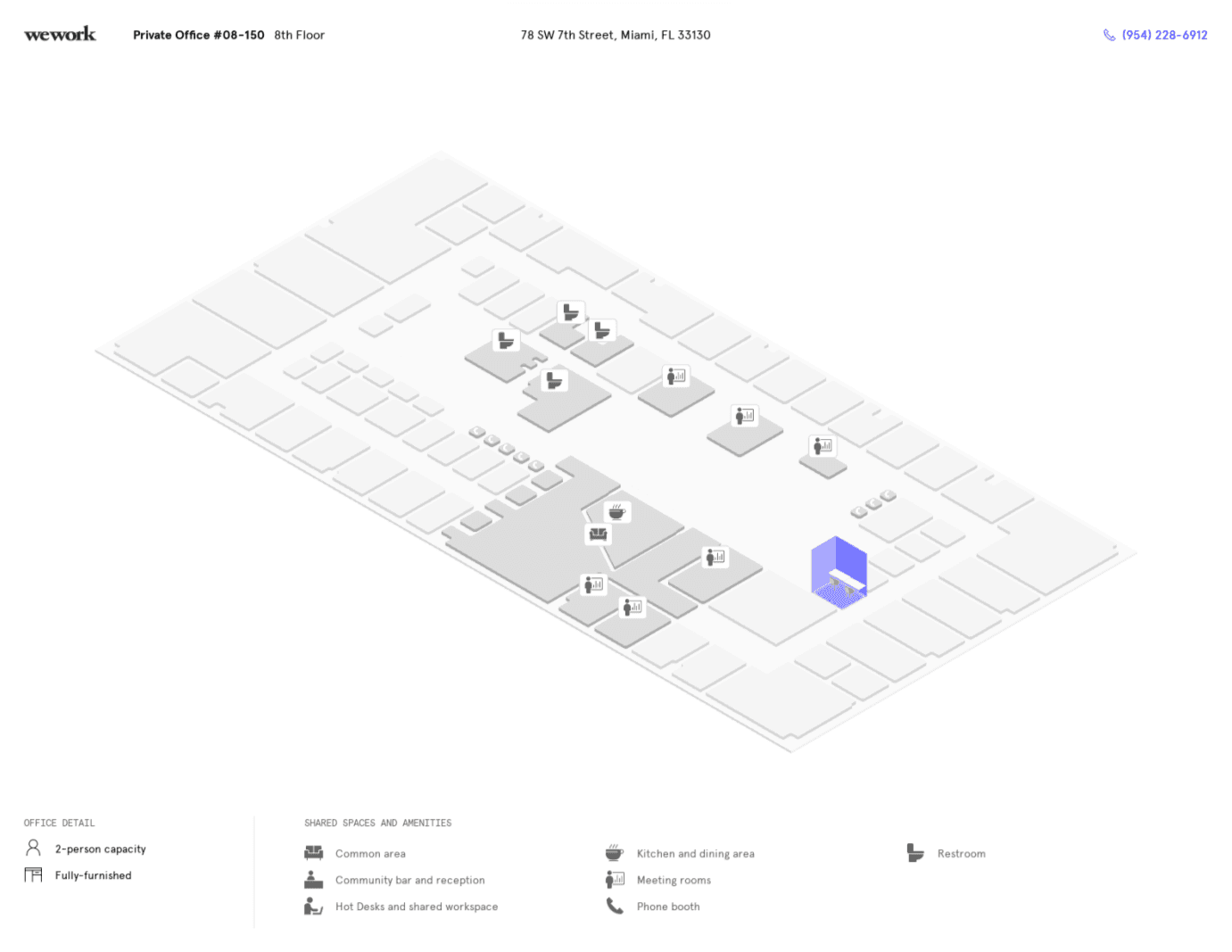
I was really curious to see what our map looked like and how I could use it in my design. I followed up and was able to get the map.
Honestly, it wasn’t a bad map, it was good enough, but it didn’t satisfy me; before anything else, we had to review the seating arrangement on the map and reality, so we decided to go there for a visit.
But I wasn’t satisfied, I wasn’t satisfied with the appearance of the map. I thought it could be much better. Of course, it was approved by the product owner, but not by me. So I decided that when we go for a visit (to review the seating arrangement on the map and reality), I would do some extra work.
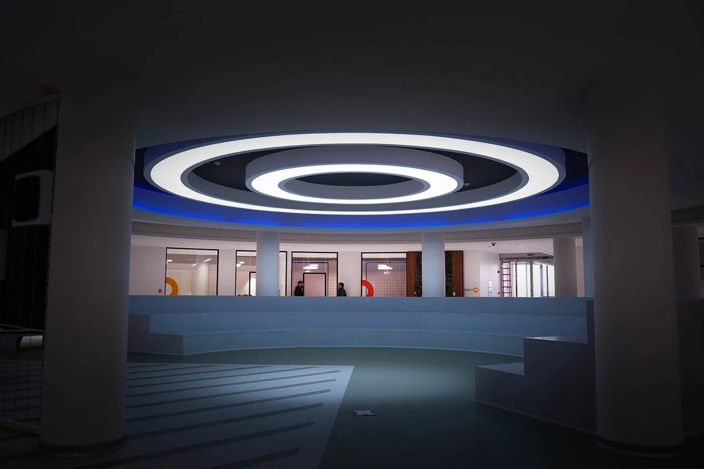
The space was a dream, it was huge and perfect for the work, but the map was a mess, it was missing a lot of important information.
I started exploring each room (Rooms that were renamed to “Zone” e.g. Red Zone), counting the desks and comparing them to the map.
I had my laptop in one hand and I tried to mark anything extra or missing. I wanted to get a more complete map, even if it wasn’t pretty.
When I got back, I started designing the map properly.

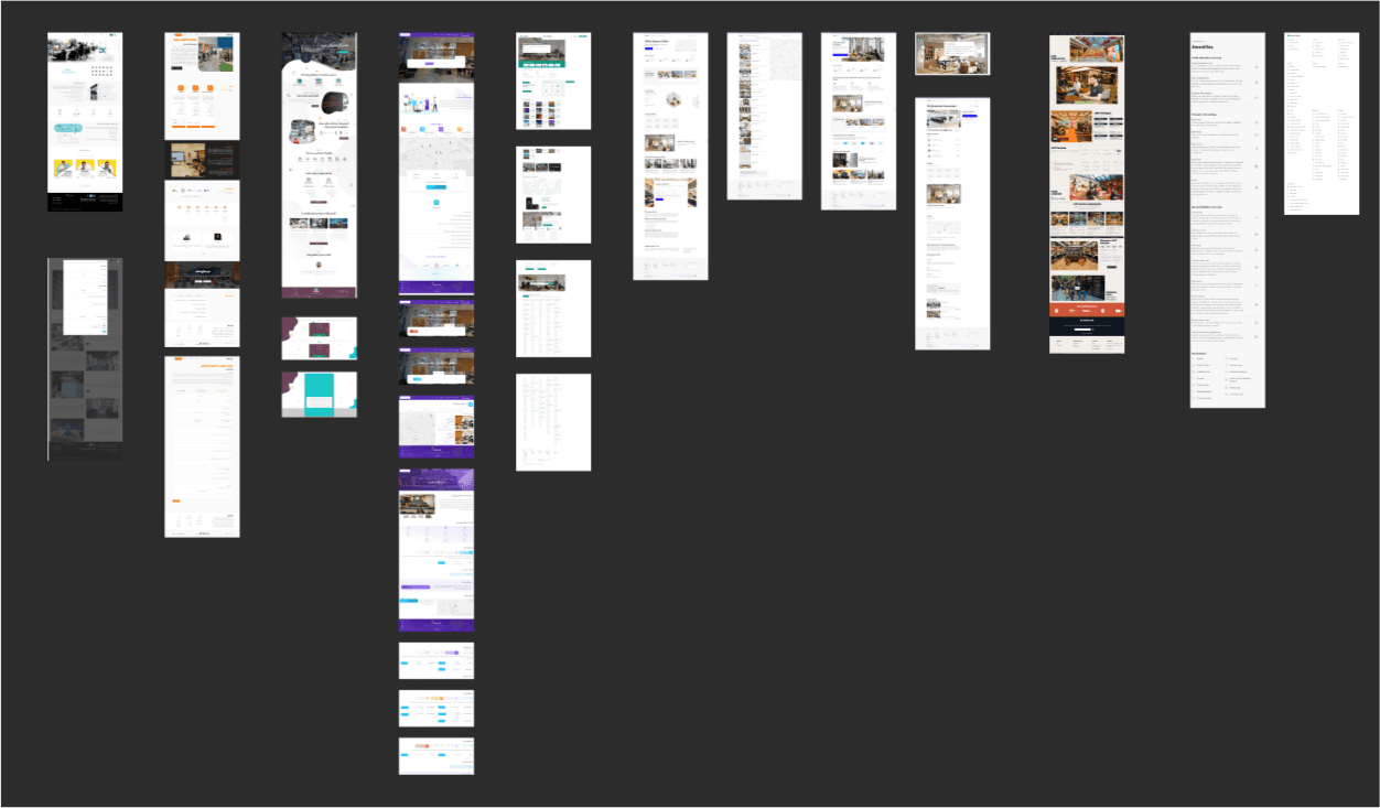
The Evolution of the Ozone Map
The map was supposed to let users book a Desk and get a feel for the space.
We were short on time and our target audience was huge (students, freelancers, professors, teams, startups, anyone who needed a desk). We had users who were ready to use this product, so I skipped user interviews and persona creation due to time constraints. I just started with a small, hypothetical user story.
User story:
I need a desk to work.
I want to see the space, choose a plan, and book a date and desk.
It was a simple process.
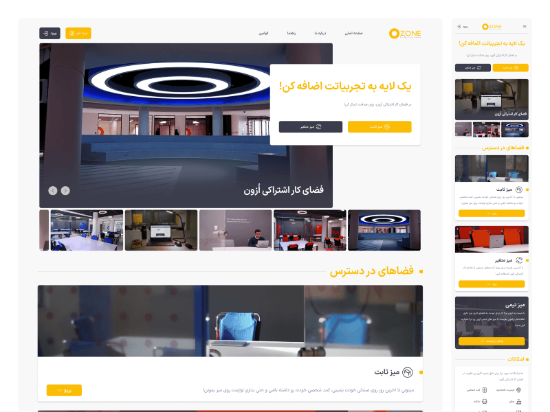
Our users needed to get a feel for the space, and we had a great space. So, the first section started with photos to grab their attention.

The first thing users see when they visit the site is a header, photos, a slogan, and two CTA buttons.
The second thing was the plans.
Users need to select a plan to book, so I added a section with two plans that we were going to offer initially.
Each plan included:
A photo (for example, all Hot Desks were orange, so we also included a photo of the same desk)
The name of the plan (Dedicated Desk — Hot Desk)
A brief description of the plan (we highlighted the main difference between the two plans)
A booking CTA button

The product owner wanted to keep the booking process simple and efficient, so they insisted on keeping it all on one page. This would also make it easier for users to compare the two plans.
The team also suggested using accordion-style cards, which I thought was a great idea.
One of the other issues we faced was the booking process. The problem was that the user had to choose or fill in which field first?
To solve this problem, I decided to go with the simplest layout, which was rows and columns. I started from the right and did my best to put them in order.

The user had to choose a plan type and start date. I used radio buttons for the plan type, with one month as the default. The start date was a calendar with today as the default.
The map would update and refresh whenever the user changed the plan type or start date, so the user would know about the change and the updates.
The user selected a Desk from the map. The reservation information displayed a key piece of information.
The user clicked “Pay and Complete Reservation (پرداخت و رزرو نهایی)” to go to the payment gateway.
The hard part was done. The biggest and most important parts of the website were designed. The only things left were the profile, login, and registration pages.
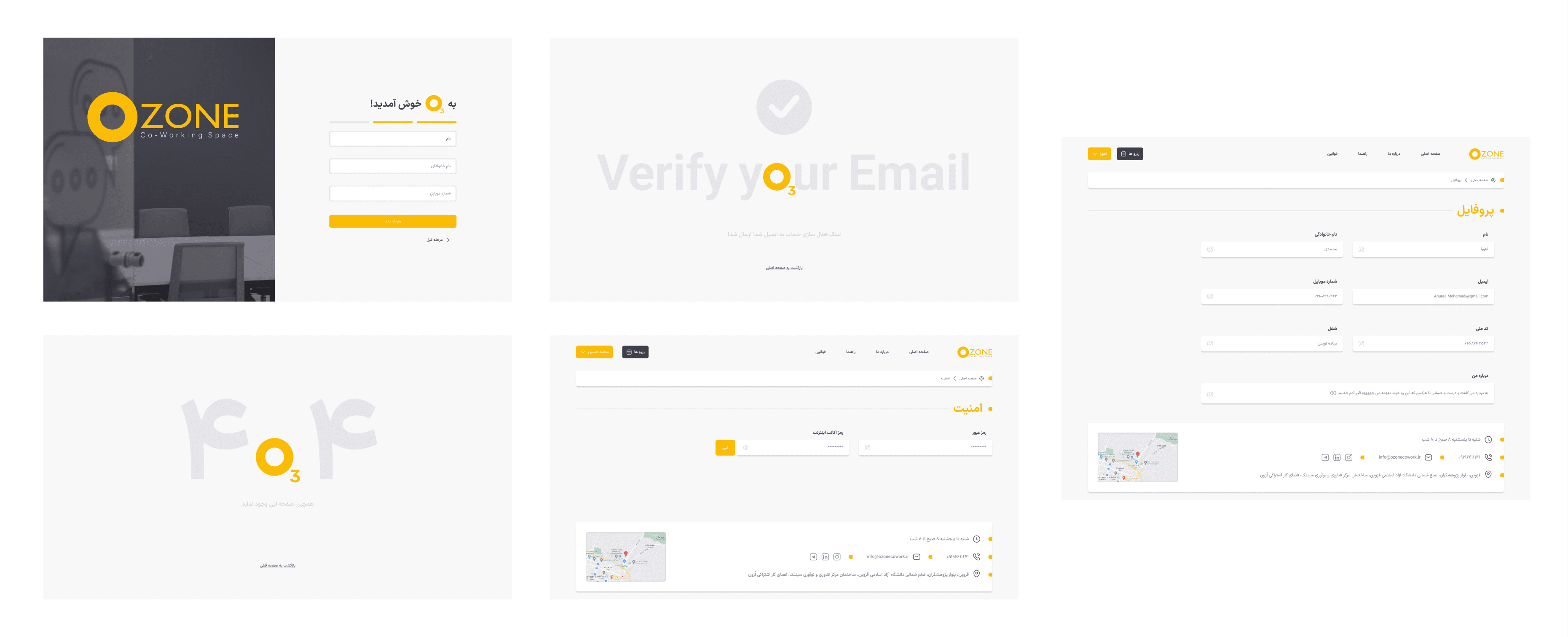
Pages: Registration — Email Verification — Error 404 — Security — Profile
The “Reservations” page was another important section. Users could see their past, active, and upcoming reservations, along with info about each reservation. I’ll talk more about it in a future post.
The design was almost done, and I was eagerly awaiting the user’s reaction. :)
. . . . .
This is a brief overview of the entire design process for the Ozone co-working space website. I tried to focus on the most challenging aspects in this post.
It actually took a lot more time and effort than I mentioned, especially for things like:
Choosing and purchasing fonts
Photography and Editing
Icon design
Copywriting
A/B testing
Accessibility testing
Thanks for reading to the end, and I hope you found it interesting.