From Frogs to Desks: How Nature Inspired a Better User Experience + Usability Test
In this article, I will discuss how I improved the user experience of understanding the desk directions on the map of the Ozone coworking space website. Specifically, I will address the following:
What is the problem?
How did I identify the problem?
What process did I follow to fix the problem?
What solution did I propose?
What did I learn?
What were the usability test findings?
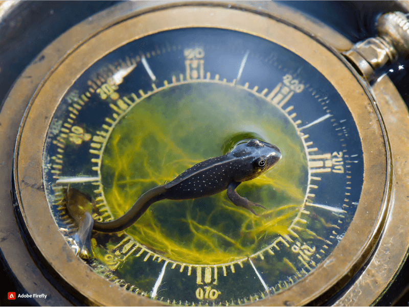
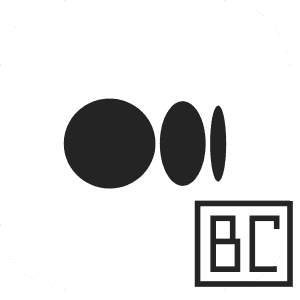
A tadpole in the compass
. . . . .
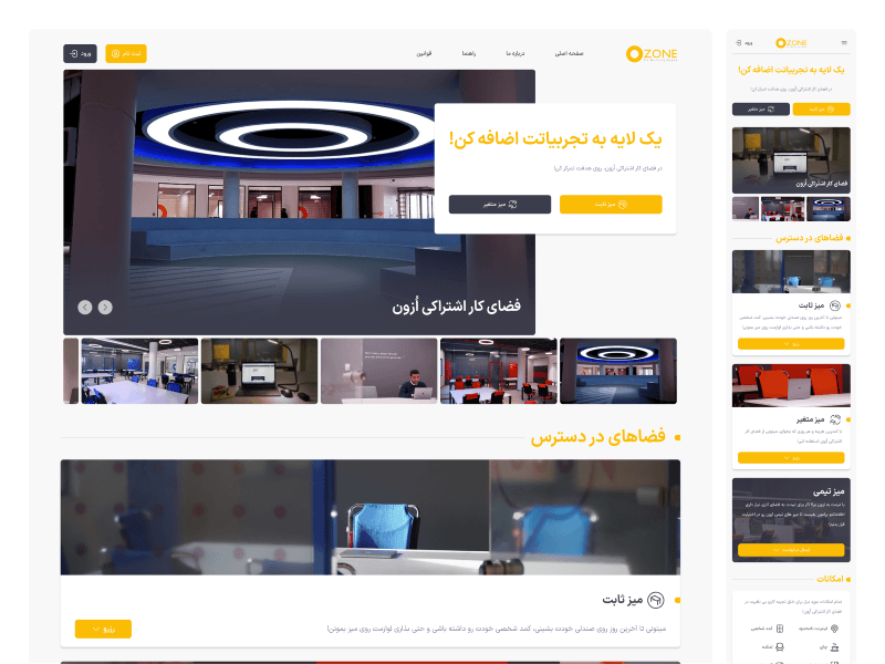
Ozone: What is it and what does it do?
Ozone is a coworking space that allows people to book a desk, either daily or monthly, and enjoy additional amenities such as meeting rooms, high-speed internet, conference rooms, a kitchen, a dining hall, and more.
One of the website’s winning features is the online booking option, which allows users to select their desired plan and date, even choose their desk location from the Ozone map, and finalize their reservation with the option of online payment.
. . . . .
What is the problem?
Finding the right direction is a common problem that everyone faces at some point in their lives. It can be difficult to know which way to go, whether we are literally lost in the wilderness or simply trying to figure out our path in life.
There are many tools that can help us find the right direction, such as compasses, maps, and mentors.

On the Ozone map, when you want to reserve your favorite Desk, you also face the issue of which direction is the true direction for the Desk you choose?
I hope there is a wall behind me because I don’t want anyone to see my monitor screen.
I hope there is a wall in front of my desk because I don’t want the presence of another person in front of me to distract me.
And other similar concerns.
How did I identify the problem?
During one of our meetings with the business side, a need was expressed for a preview of the Desk locations using real images next to the map. However, this need was rejected due to technical limitations and other issues.
After the meeting, I thought about why this need was raised. If it is a serious need, is there a short-term solution?
To confirm the need for this feature, I spoke with my colleagues at the information desk and asked if any users had ever experienced this issue.
Based on the information I gathered from them, I realized that this problem had occurred several times. One user even booked a desk assuming the wall was behind it, but when he arrived in person, he realized his assumption was wrong and had a lot of trouble with it, which caused problems for the information desk staff.

It seems like the whole world can see this man’s monitor screen.
What process did I follow to fix the problem?
A unique feature is essential for any product, as it sets it apart from its competitors. However, when you want to improve that feature, you cannot rely on competitor analysis, as your competitors may not have the same needs or requirements as your users.
In our case, We were working on a feature that would allow users to see and reserve desks on a map. Our competitors in Iran did not have this feature,
Only CinemaTicket provided the ability to reserve a seat from the map for its users. However, the direction of the seats was completely clear there and all seats were facing the cinema screen.
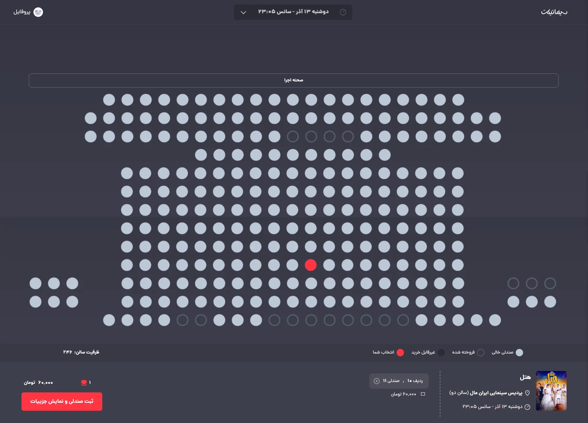
How to choose a seat in Cinematicket.
One of the cases that was similar to our model was provided by WeWork. The difference was that they had placed a PDF map of the desk location as a 3D illustration design so that the user could download the file to find out the position and direction of their seat.
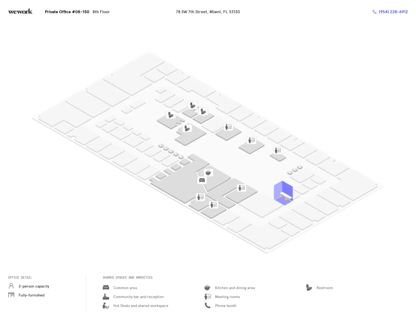
A sample of a PDF file of the WeWork.
Due to the design model, As I could not add a significant amount of detail to the map, I had to look for a minor alteration.
Until the end of the day, I tried to see many samples, from things that were completely related to the issue to irrelevant things. However, I could not find anything that could give me an idea.
The next day, I had a lot of tasks and could not set aside any time for this issue. However, I was thinking about it in the back of my mind.
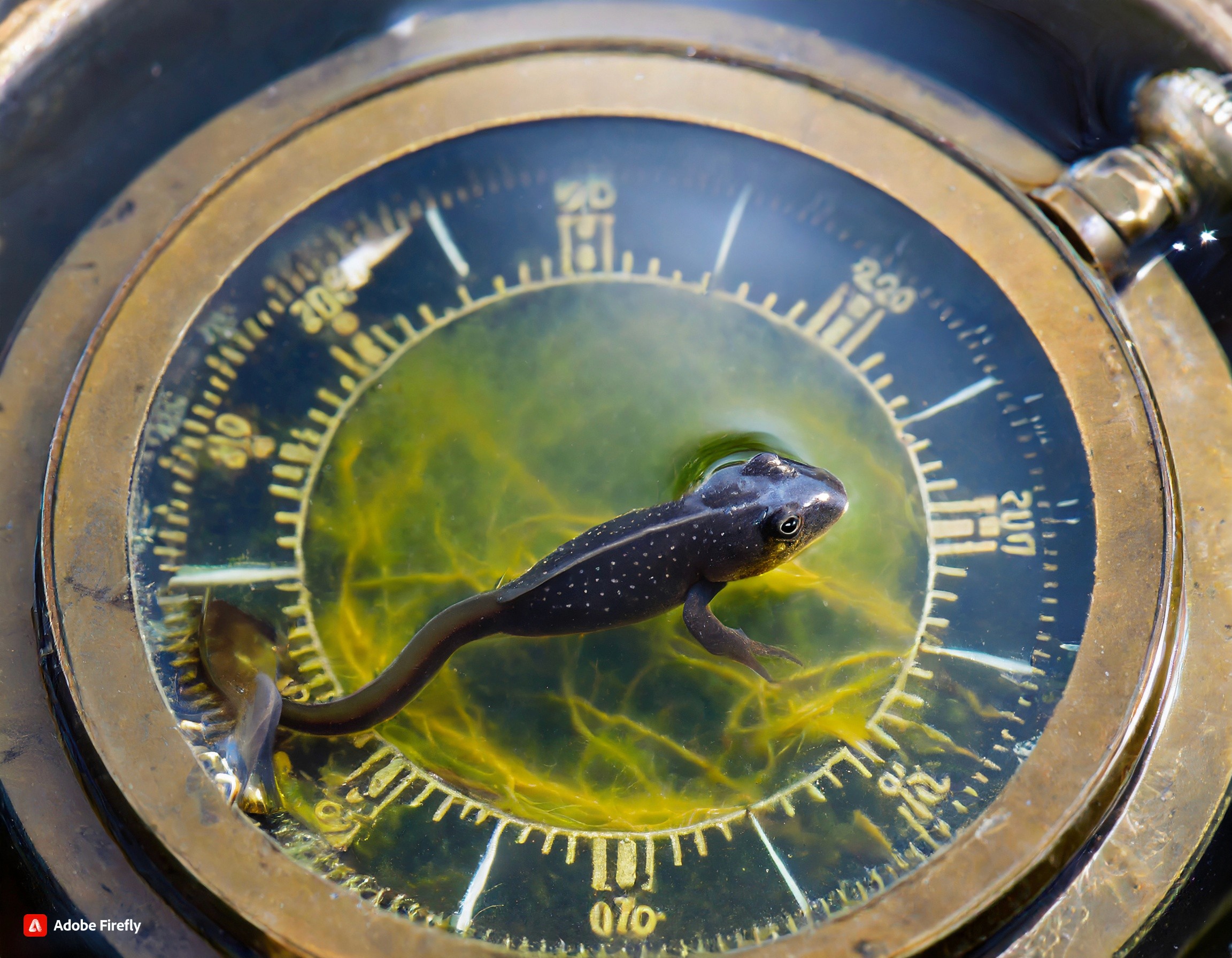
When I got home, I took the opportunity to search for something. However, I could not find anything. I went out of my room to get a glass of water. The TV was showing a wildlife documentary about Tadpole. The scene was interesting. Tadpoles were swimming in the water. They looked like they had long tails and were changing their direction of movement quickly.
Tadpoles paddle through the water, their small bodies moving in graceful arcs.
Tadpole + tail = understanding the direction of their movement
Desk + tail = understanding the direction of the Desk
It was really interesting. I was surprised that I came up with this idea while seeing tadpoles.

What solution did I propose?
We could help users understand the direction of a desk by adding a small tail to the end of each desk.
This solution is not as effective as showing a real image of the desk, but it is better than nothing.
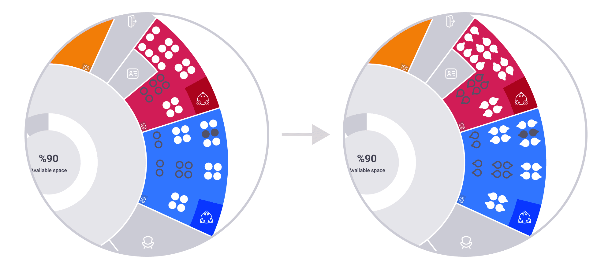
Tadpoles’ Desks were Replaced with Old Desks.
What did I learn?
It makes me laugh to think that I came up with this solution by seeing tadpoles. Before that, I thought that I always had to follow a specific method to get results. However, as Jeffrey George, one of the founders of UX Mastery said in his speech at the UX Lisbon 2023 conference titled “How to Use Nature to Improve User Experience”:
“Don’t be afraid to think outside the box. Nature can often provide us with great solutions for our products.”
I learned from this experience that it is important to think outside the box, especially for problems that require creativity or innovation.
What were the usability test findings?
February 2024 Update
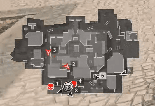
Call of Duty map that shows the user’s direction with a triangle
This was great feedback, offering a different and broader perspective. To understand whether my idea would solve the user’s problem or confuse them, I needed to conduct a usability test.
The next day, I created a simple scenario to gather feedback from real users.

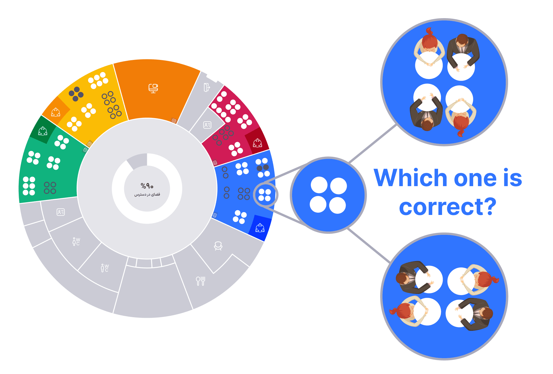
Map of a hypothetical coworking space
Scenario:
Let’s imagine that Ozone has another branch, and this is the map of that branch.
There are two rooms in this branch that are surrounded by walls and have no windows.
Assuming you can choose any table you want, which table would you reserve?
Why?
Why did I create this scenario?
When users choose their table from a map like this, they only consider the table’s location and orientation, not other factors.
When I ask users why they chose a particular table, I expect them to say something like, “I chose it because it’s near a wall” or “I chose it because I have a wall behind me.”
I called this test the “walk-up test” because I walked around the Ozone coworking space with my laptop and invited anyone free to participate.
Hey Arash, how are you? Come take a look at this for a second.
What were the outcomes of the test?
I conducted this walk-up test with 7 people, with the following results:
5 people were able to choose their table without any problems. They mostly chose tables near the walls. When I asked them why? they said things like, “I like to have a wall behind me so people can’t see my monitor.”
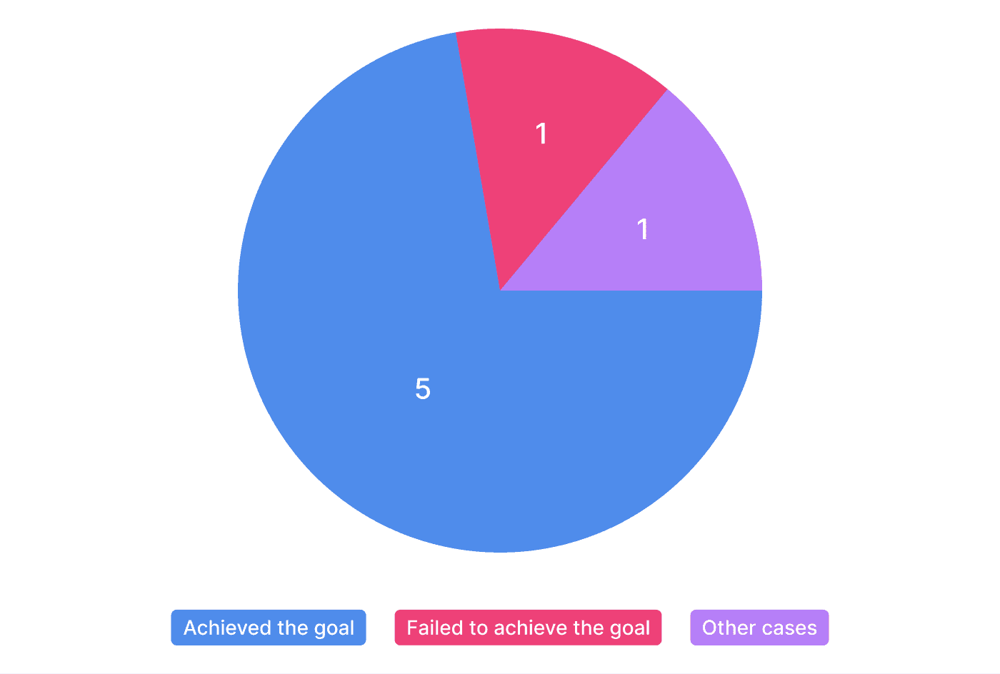
Outcomes of the test
However, the 6th user completely misunderstood the direction of the arrow. She thought that the arrow was pointing toward the user’s back. When I asked them why they thought this, they said, “In architecture, we draw toilet bowls in this exact way to show the direction of the users”
She then asked me, “Why did you put toilet bowls in Ozone?”

The 7th user’s behavior was very strange. He didn’t care about the arrow at all and thought that all the tables in the upper row of the room were facing upwards, and the tables in the lower row were facing downwards (as I indicated in the image).
I was trying to explain to him to pay attention to the map, but he didn’t seem to be paying attention at all. It was as if he were reserving a table in his own mind.
I have no idea what I could have done differently.
Based on the results of my usability test, I believe my idea can be helpful for our users and will not confuse them.